The Power of Heat Maps: Transforming Data into Actionable Insights

In today’s data-driven world, understanding user behavior and making informed decisions are crucial for success. One powerful tool that helps achieve this is the heat map. Heat maps provide a visual representation of data, making it easier to identify patterns, trends, and areas of interest. In this blog, we’ll explore the importance of heat maps and how they can benefit businesses in digital marketing, data analytics, and online education.
What is a Heat Map?
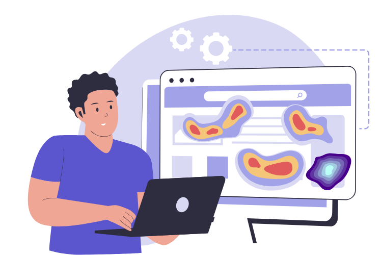
A heat map is a data visualization tool that uses color to represent the magnitude of values in a matrix. Warmer colors (like red and yellow) indicate higher values or more activity, while cooler colors (like blue and green) represent lower values or less activity. This visual format allows for quick and intuitive understanding of complex data.
Importance of Heat Maps
Heat maps are essential because they provide a clear and immediate way to interpret data. They help businesses and educators understand user interactions, identify hotspots of activity, and uncover areas that need improvement. By visualizing data in this way, heat maps make it easier to make data-driven decisions that enhance user experience and optimize performance.
Benefits of Heat Maps in Digital Marketinga
In digital marketing, heat maps are invaluable for optimizing websites and improving user engagement. They allow marketers to see where visitors click, how far they scroll, and which parts of a page attract the most attention. This information helps in:
Improving User Experience:
By identifying which areas of a website are most engaging, marketers can optimize the layout and content to enhance user experience. For example, if a heat map shows that users are not scrolling past a certain point, it may indicate that the content below is not engaging enough or that the page is too long.
Increasing Conversion Rates:
Heat maps reveal where users are most likely to click, helping marketers place calls-to-action (CTAs) in high-traffic areas to boost conversions. For instance, if a heat map shows that users frequently click on images, placing a CTA near these images can increase the likelihood of conversions.
Reducing Bounce Rates:
Understanding user behavior helps in identifying and addressing issues that cause visitors to leave a site prematurely. If a heat map shows that users are leaving a page quickly, it may indicate that the page is not meeting their expectations or that there are technical issues that need to be addressed.
Benefits of Heat Maps in Data Analytics
In data analytics, heat maps are used to visualize complex data sets and uncover insights that might not be apparent from raw data. They help analysts:
Identify Trends and Patterns:
Heat maps make it easy to spot trends and patterns in large data sets, facilitating better decision-making. For example, a heat map of sales data can reveal which products are most popular in different regions, helping businesses tailor their marketing strategies accordingly.
Enhance Data Exploration:
By providing a visual summary of data, heat maps enable analysts to explore and understand data more effectively. This can be particularly useful in exploratory data analysis, where the goal is to uncover hidden patterns and relationships in the data.
Improve Decision-Making:
The insights gained from heat maps support data-driven decisions that can lead to improved business outcomes. For instance, a heat map of customer feedback can highlight common issues and areas for improvement, helping businesses prioritize their efforts.
Benefits of Heat Maps in Online Education
In online education, heat maps are used to track and analyze student interactions with educational content. They help educators:
Gauge Student Engagement:
Heat maps show which parts of the content students interact with the most, helping educators understand what engages students. For example, if a heat map shows that students spend a lot of time on a particular video, it may indicate that the video is particularly engaging or that the topic is challenging.
Improve Course Design:
By identifying which areas of a course are most and least engaging, educators can refine and improve course materials. If a heat map shows that students are skipping certain sections, it may indicate that these sections are not clear or engaging enough.
Track Skill Development:
Heat maps can be used to visualize student progress and skill development over time, providing valuable feedback for both students and educators. For instance, a heat map of quiz results can highlight areas where students are struggling, allowing educators to provide targeted support.
Conclusion
Heat maps are a powerful tool that can transform complex data into actionable insights. In the fields of digital marketing, data analytics, and online education, they play a crucial role in understanding user behavior, optimizing performance, and making informed decisions. By visualizing data in an intuitive and accessible way, heat maps help businesses and educators identify trends, uncover areas for improvement, and enhance user experiences.

